How To Create A Histogram In Excel 2013
Contents:
How to Create a histogram in Excel:
- 2016 – current
- 2013
- 2010-2007
Excel 2016
BINS (i.e. categories that become the "bars" in the graph) are automatically created in Excel 2016 using Scott's Rule.
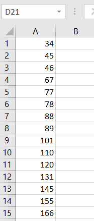
Step 1: Enter your data into a single column.

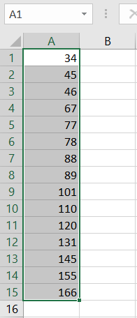
Step 2: Highlight the data you entered in Step 1. To do this, click and hold on the first cell and then drag the mouse down to the end of the data.

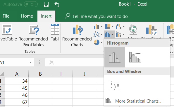
Step 3: Click the"Insert" tab, click statistics charts (a blue icon with three vertical bars) and then click a histogram icon.

Excel 2013
Watch the video for the steps:
Can't see the video? Click here.
Histogram in Excel 2013: Steps
Step 1: Load the Data Analysis Toolpak, if it isn't already installed. To check if the Toolpak is installed, click the "Data" tab and look to the far right; if you see Data Analysis, then the Toolpak is installed.
Step 2: Enter your data into a single column. For example, type your values into column A.
Step 3: Enter your BINs into a single column (for example, column B) (What is a BIN in statistics?). In Excel, you'll want to enter the upper boundary for the BINS in that column. For example, if you have 0-10, 11-20 and 21-30 you would enter 10,20,30.
Step 4: Click the "Data" tab, then click the "Data Analysis" button.
Step 5: Highlight "Histogram" and then click "OK."
Step 6: Type the location of your data into the Input Range Box. For example, if your data is in cells A2 to A10 then type A2:A10 into the box.
Step 7: Type the location of your BINS into the "Bin Range" box. For example, type "B2:B4" into the box to indicate your BINS are in cells B2 to B4.
Step 8: Click an option for where you want your data to appear. For example, click the "New Worksheet" button.
Step 9: Check the "Chart Output" box. If you don't check this, you'll only get a frequency chart (a list), not the actual histogram.
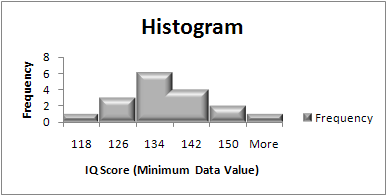
Step 10: Click "OK" and Excel will create the histogram.
Tip: Histograms traditionally do not have gaps between the bars. To correct this, right click just outside the chart area (but within the chart window). Select "Format Chart Area" and click the down arrow next to "Chart Options." Select "Series Frequency." Click the Three Bars to the right (Series Options." Use the slider to make the gap width zero.
Excel 2007-2010
Watch the video for an example:
Can't see the video? Click here.
How to Create a Histogram in Excel 2007/2010: Overview

How to Create a Histogram in Excel 2007/2010: Steps
Step 1: Enter your data into a single column. For example, you might have a list of IQ scores (118, 123, 124, 125, 127, 128, 129, 130, 130, 133, 136, 138, 141, 142, 149, 150, 154). Enter those scores in cells A2 to A18.
Step 2: Enter your lowest value into the second cell of the next column. This is the start of your first bin. In our example, we put the values in column A, so we need to put 118 (the lowest value) into cell B2.
Step 3: Enter the rest of the minimum data values for your bins into the same column from Step 2. If you're not sure how to calculate these values, see this article on how to create a frequency distribution table.
Step 4: Click on the "Data" tab and then choose "Data Analysis." If you don't have the Data Analysis button, you need to add the ToolPak (it only takes a few seconds). See this how to on how to load the Microsoft Excel Data Analysis ToolPak for instructions.
Step 5: Click on "Histogram" and then click on "OK."
Step 6: Click on the cell icon to the right of "Input Data."
Step 7: Click on the first value in the column of data (in this example, that's cell A2). Hold down the shift key, and then click the last cell in that column with a value (in this example, that's cell A18). Press the "Enter" key.
Step 8: Click on the cell icon to the left of "Bin Range."
Step 9: Repeat Step 7, only this time, input your first and last bin values (those are the minimum data values).
Step 10: Click on "Chart Output."
Step 11: Press "OK."
Tip: To make the histogram bars touch each other, right click and choose "Format Data Series." Move the "Gap Width" toggle bar to "No gap" and then click "Close."
That's it!
Check out our YouTube channel for more stats help and tips!
References
Kotz, S.; et al., eds. (2006), Encyclopedia of Statistical Sciences, Wiley.
Lindstrom, D. (2010). Schaum's Easy Outline of Statistics, Second Edition (Schaum's Easy Outlines) 2nd Edition. McGraw-Hill Education
Levine, D. (2014). Even You Can Learn Statistics and Analytics: An Easy to Understand Guide to Statistics and Analytics 3rd Edition. Pearson FT Press
Vogt, W.P. (2005). Dictionary of Statistics & Methodology: A Nontechnical Guide for the Social Sciences. SAGE.
------------------------------------------------------------------------------
Need help with a homework or test question? With Chegg Study, you can get step-by-step solutions to your questions from an expert in the field. Your first 30 minutes with a Chegg tutor is free!
Comments? Need to post a correction? Please post a comment on our Facebook page .
How To Create A Histogram In Excel 2013
Source: https://www.statisticshowto.com/probability-and-statistics/excel-statistics/histogram-in-excel/
Posted by: sainanderser.blogspot.com

0 Response to "How To Create A Histogram In Excel 2013"
Post a Comment